After some feedback on a shot that I quite like, but I’m not sure
If only they had shut that window!!
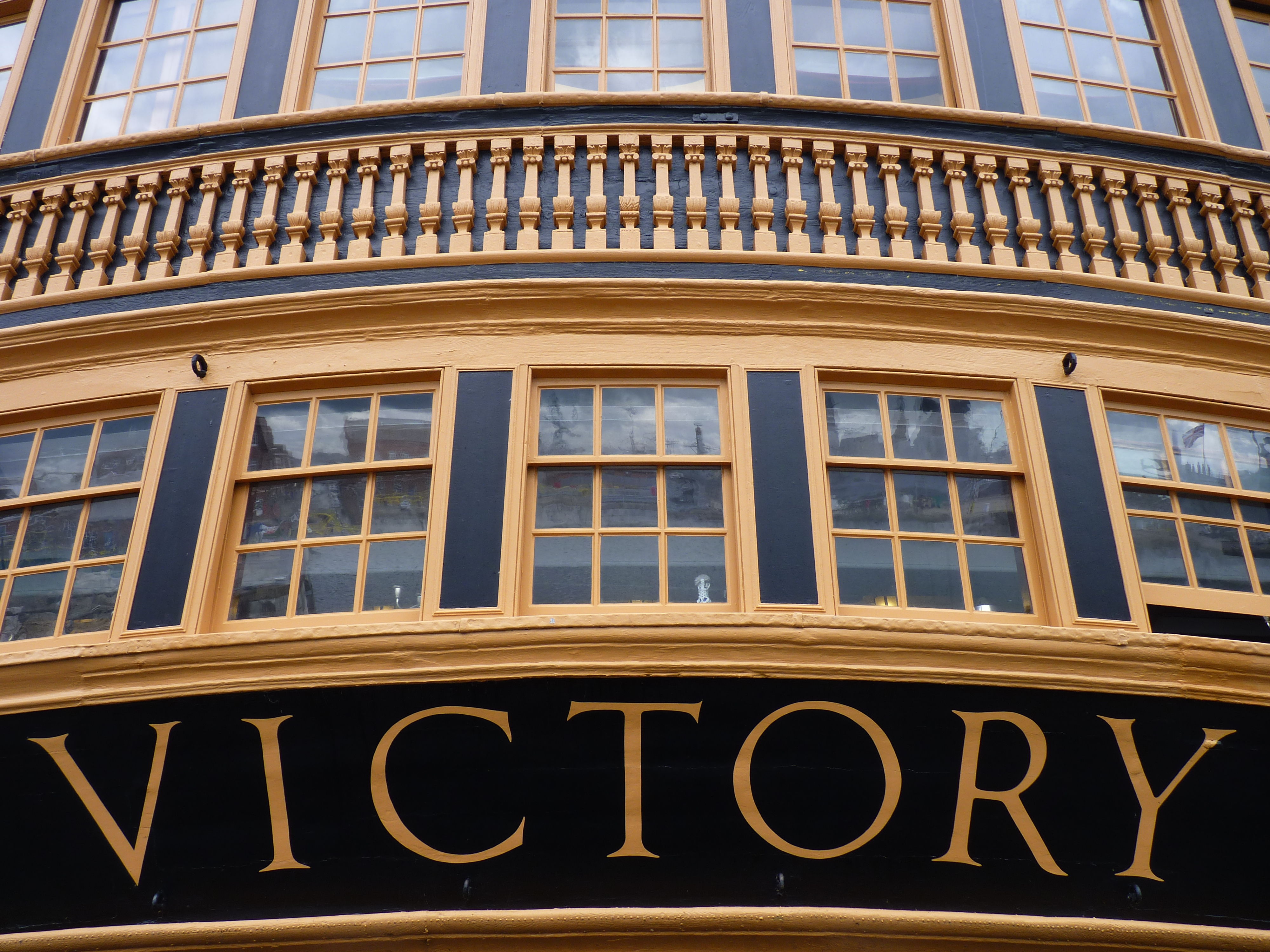
After some of the recent shots in low light, I’ve started to alter the exposure and also the camera has a neat trick of taking three pictures on one click, + - 0, setting on exposure. We’ve had some mixed results today, really starting to look at the camera setting a bit more as Michael has composition as a natural eye.
What do you think? Click the link to get the full size as it came off the camera.
At the first instant of viewing there’s an immediate punch, quickly followed by the realisation of what it is.
In some respects the open window and the little nic-nacs inside add some interest as the eye wanders round the frame. I particularly like the reflections in the lower windows, especially the bow of the ship with sailors standing under the Union Jack, subtly showing the continuation of this heritage up to present times.
Of course all of this would be missed if the photo didn’t grab the viewer in the first instant by its overall shape and contrast. That’s the job of good composition; and this definitely has it
I think you may have just nailed the little bit I wasn’t sure about, couldn’t get the top windows in shot fully and yet keep the impact of the writing. If I had leant any further back from the walkway, I would have got a little wet :lol:
Lumix FZ38 - and the ± exposure thing has a name apparently :lol: I looked it up in the manual when we got home and JonWoad on Aria also helped me find the right part of the manual, it’s called bracketing apparently :lol:
A friends Fuji does a similiar thing with indoor photos, takes one with flash and one without.
[QUOTE=DoubleTop;455615]I think you may have just nailed the little bit I wasn’t sure about, couldn’t get the top windows in shot fully and yet keep the impact of the writing. If I had leant any further back from the walkway, I would have got a little wet :lol:
DT.[/QUOTE]
IMO if the top windows were all in frame would not add any extra information to the shot and would not be such a good composition.
As it is, the wording part nicely obeys the rule of thirds, which is why it looks balanced.
I downloded and had a play with this shot but believe it rude to post back peoples images.
I think you could give the image still more punch by brightening the mid tones, sharpening a little and warming the colour a touch. If you have a tool to correct the blue/yellow colour aberration I can see on the right and left contrast edges, so much the better.
From an aesthetic point of view for me, as you couldn’t get symmetrical or back far enough to get the full shot it would have been perhaps better to frame it differently so it didn’t look like it was supposed to be a technical shot, instead more of an artistic shot… even perhaps at an angle.
Not that i’m really qualified to comment but I hope you understand what I mean. :lol:
I agree with Peige. The only thing different I would have done was to make the name the focus and fade the rest to centre the attention. Otherwise a lovely little shot.
Tried to describe this but could not, so even though it’s a no-no I’ve cropped it and reposted. Shoot me.
I really like this picture but I think the top is too busy and drags the attention upwards, so I mucked about with a simple crop. Cropping the sides in just ever so slightly cuts out the partial windows in the top corners and improves it I think, but then I went a bit more radical and cropped the top windows out completely. This restores the focus and the open window becomes a nice feature because it ruins the symmetry.
All subjective I know, but you asked for opinions so there ya go…